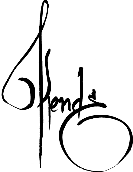
Calligraffiti Kende: where graffiti becomes calligraphy
Kende’s calligraffiti does not stem from a theoretical fusion of two disciplines. It stems from the walls. Thirty years of practising on the walls of Milan, London, Amsterdam, Paris and Barcelona — a journey that has transformed the act of writing into a recognisable and coherent calligraphic language.
From graffiti to urban calligraphy
European graffiti in the 1990s was all about speed, risk and territory. Kende emerged from that era and bears its mark — rounded letters, a predominance of black, and a signature that experts recognise even when he changes his tag. Over time, his style has become more refined: the spontaneity of graffiti blends with the precision of calligraphy, without losing any of its original energy.
The result is Kende calligraffiti: a hybrid style that belongs neither to traditional calligraphy nor to pure graffiti. It belongs to those who have practised both, for years, on real surfaces.
A design language for high-quality interiors
What the newspapers haven’t reported is the journey: thirty years of practice, a trajectory that spans 1990s European graffiti, urban calligraphy, and finally fine art. The very same letters that once appeared on train carriages are now finding their way into private collections and luxury commercial spaces. The language hasn’t changed. The context has.
Calligraffiti isn’t something you learn in a studio. It is developed over time, on the streets, through thousands of pieces on different surfaces — walls, train carriages, billboards, canvases. Kende has followed this path in its entirety. What we see today in his original works and fine art prints is the distilled result of that journey: a style that embodies thirty years of European calligraffiti.